Insurtech
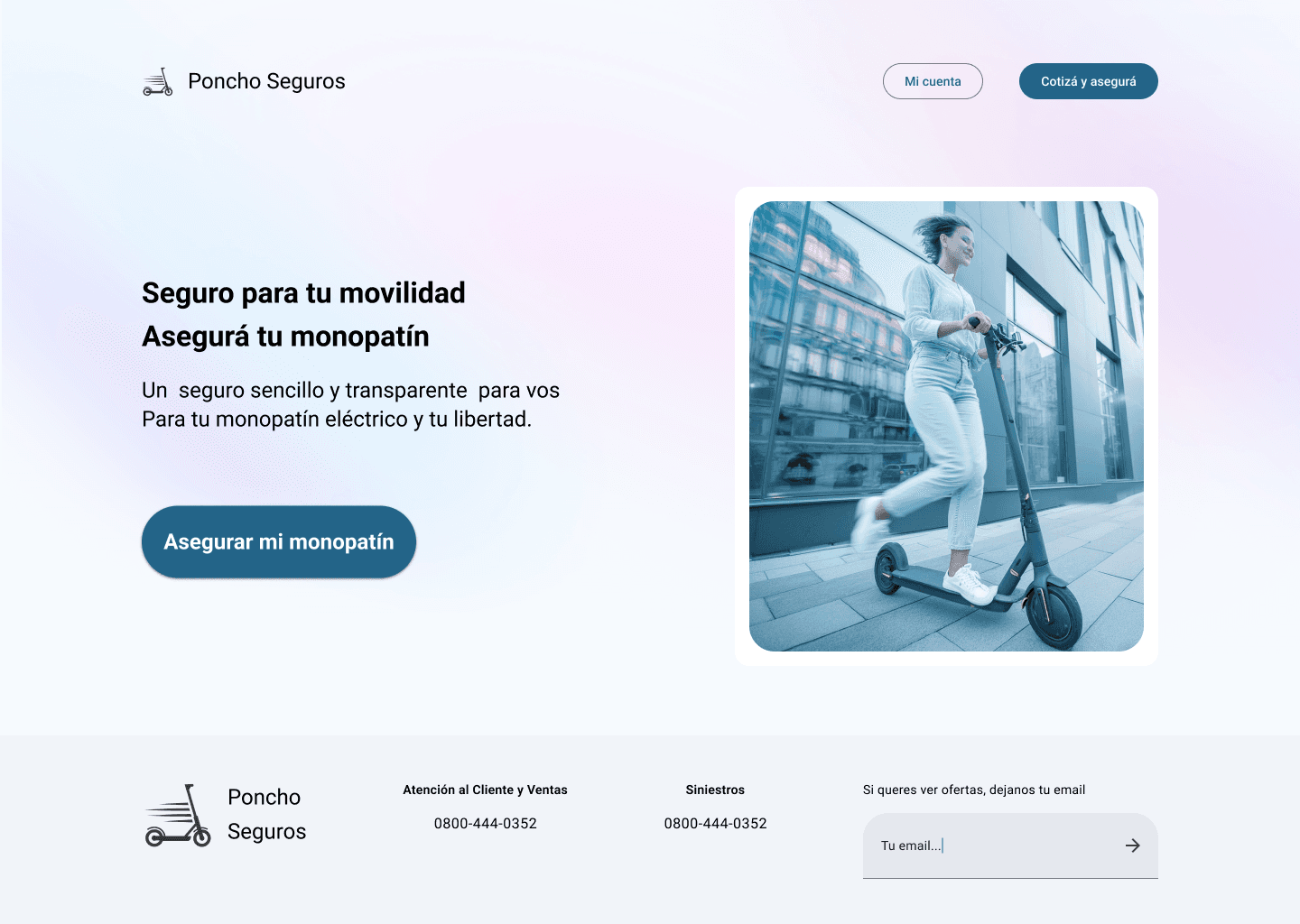
Poncho Seguros - Web Design
As part of a UX challenge, I helped Poncho Seguros create an MVP of Web Design with the goal of having their first top-tier web interface.
Problem
The manual process of urban mobility insurance for scooters is inefficient and impacts both users and the business; how can we digitize it to streamline and enhance customer satisfaction?
Outcome
In the usability test of the MVP, users easily found key features such as getting insurance quotes and signing up for coverage, achieving higher customer satisfaction and establishing the insurer's first digital platform.
Poncho Seguros
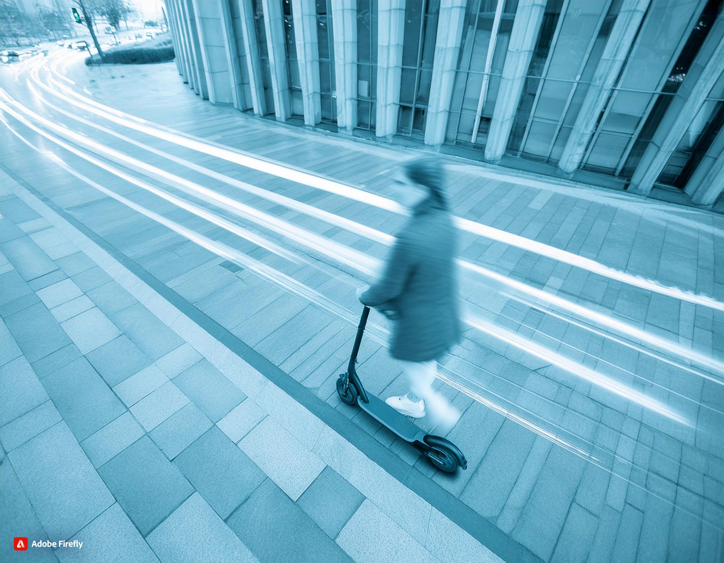
A digital solution that streamlines the insurance process for electric scooters, providing quick and reliable coverage.
35%
40%
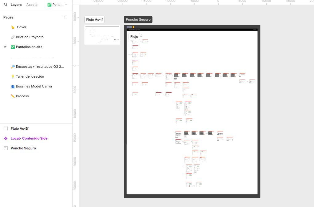
Wireframes
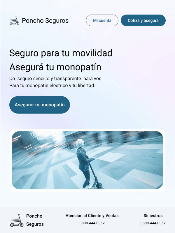
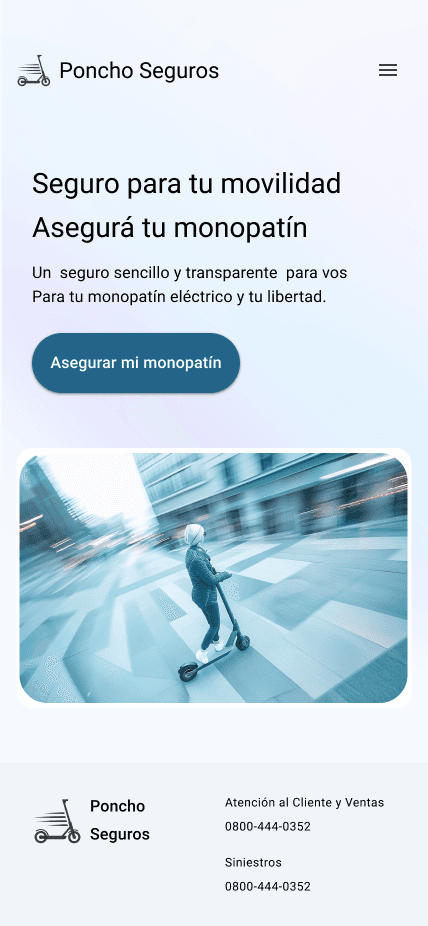
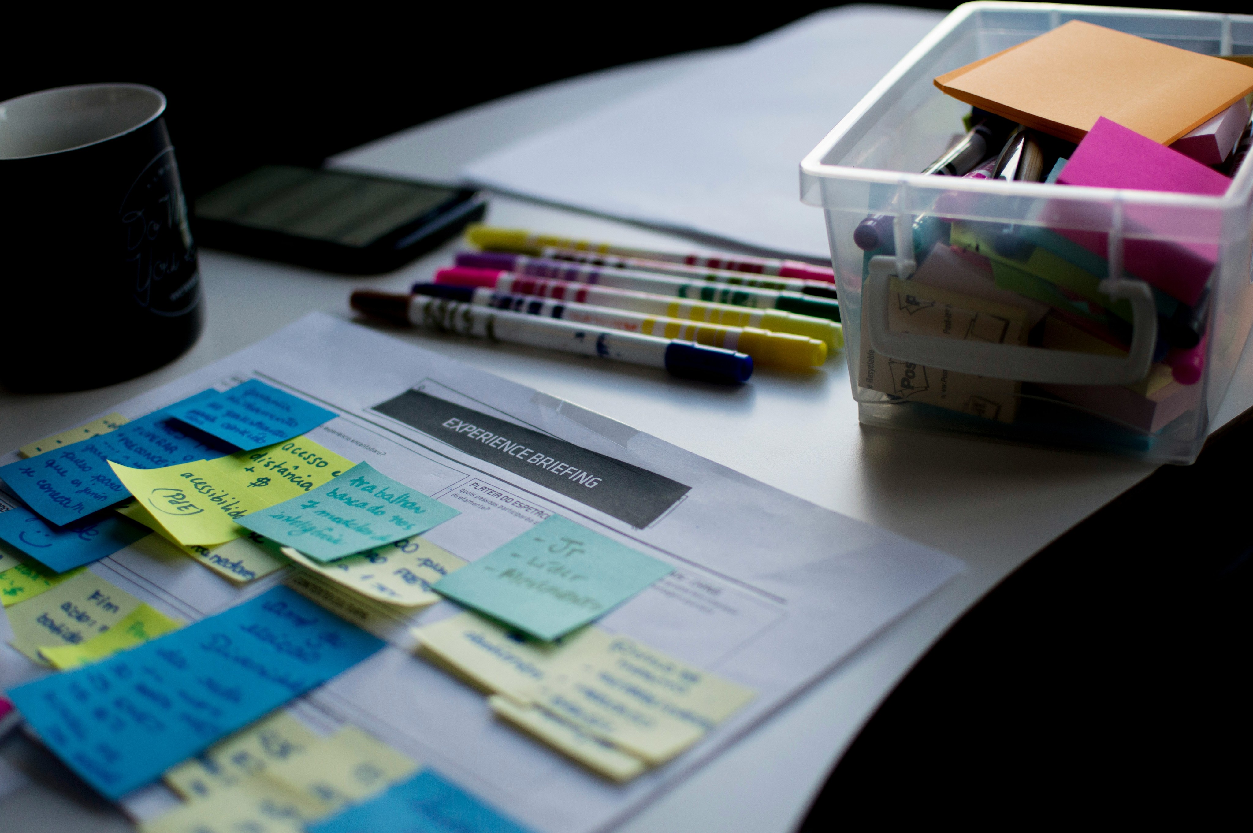
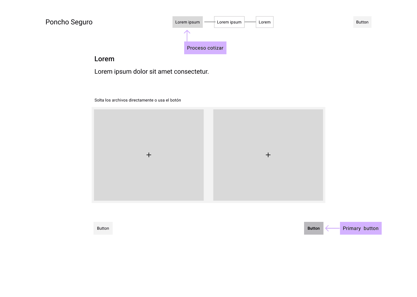
Taking the information gathered and the user flow into account, I designed low-fidelity wireframes for desktop, tablet, and mobile, focusing on key features such as quoting, insurance registration, price comparison, and authentication.

Did we manage to inspire trust, joviality, and efficiency?
That was the idea! The overall design language aimed to offer a product that conveys trust and credibility, making you feel secure. That's why the color palette was inspired by technology and secure devices, using shades of blue, light blue, and pastels to evoke calm and safety; and the typography was chosen to ensure accessibility.
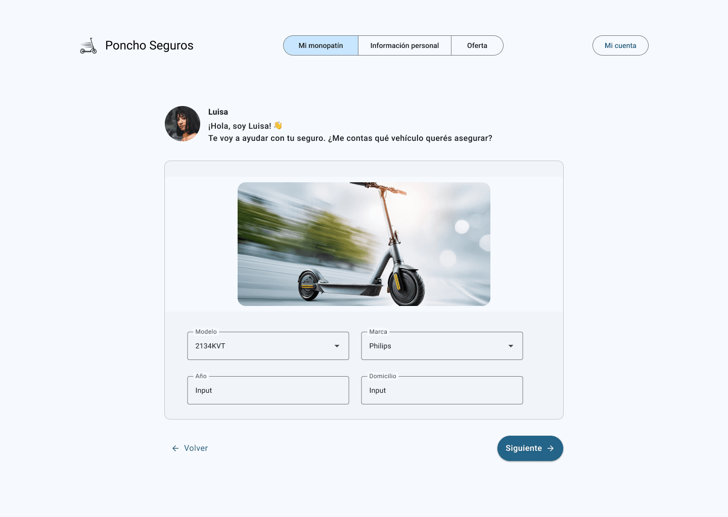
Attentive and friendly service
I decided to include a chatbot to improve the insurance process as it can be tedious. The idea is that, when quoting, the chatbot Luisa starts the conversation with a friendly greeting like 'Hi! 👋 How are you? 🌈 Could you provide me with the details of your scooter?', simulating an attentive and personalized interaction.

Final thoughts and takeaways
1 Desktop ≠ Mobile
There is a looot of space to play with on the desktop. After a long time, I set aside my typical mobile-first approach to start this MVP, gaining new insights into responsive design.
2 Research More
Some processes were missing. My suggestion was to create a user journey, a benchmark, and a sequence model to understand the manual tasks of Poncho Seguros. The interface also needs to be user-friendly for internal users!